Android vs iOS: App UI Design Differences and Comparison
Regarding Mobile app UI design, Android and iOS—the two platforms that set the trend in the mobile space, are also the greatest competitors.
The mobile UI design space has been affected by the growing interest in Android vs. iOS in terms of market share, popularity, and demography, among other factors.
Therefore, when developing an app, it is crucial to comprehend the fundamental differences between the UI designs of Android and iOS. This will aid in developing strategies for how best to develop the application so that it is compatible with these two different interfaces and gives user-friendly experiences to both the conservative and liberal audiences of the apps.
With that in mind, let's discuss the basic design distinctions between iOS and Android.
Flat Design vs. Material Design
Android and iOS differ in all aspects, from the buttons to the layouts, because of their different philosophies. Let's break them down:
Android's Material Design: This approach tends to work on layering and depth, employing shadow and subtle animations to provide depth. It is characterized by bolder colors and the use of cards to present data and information. With a dash of skeuomorphism, Android Material Design is said to be an improved version of Flat design. The Material Design language is Android's greatest user interface (UI). Android Material Design prioritizes shadows and animations for items to facilitate user navigation.
Android Material's design elements may be considered a refined form of flat design with a hint of skeuomorphism. This is the popular design theory that objects should be rendered to resemble their real-world equivalents.
Four guiding concepts underpin Android UI design:
- Making things look 3D: This means using shadows and layers to give objects depth. It helps users understand what's important (closer to the front) and what's background information.
- Using clear fonts and sizes: Different fonts and sizes help distinguish important from less important ones. Big, bold fonts grab your attention, while smaller fonts might be for details.
- Smooth transitions: Imagine flipping through a book - that's how transitions between screens should feel. They should be clear and effortless, not jerky or surprising.
- Adaptive Design: An app should look good and work well on phones, tablets, and even bigger screens. This is called "adaptive design".
iOS's Human Interface (HI) Design (formerly Flat Design): Three principles are the foundation for Flat Interface Design, often known as Human Interface Guidelines: Depth, Deference, and Clarity. Simply put, the method emphasizes typography and flat colors, employs clean components, and favors simplicity.
The Flat Design principles refer to the design standards for iOS. Apple mostly employs flat design, which reduces shadows and gives things a layer-like appearance on top of one another.
Here are three guidelines for creating iOS apps:
- Simplicity or clarity while interacting with the design aspects.
- Deference, or the content-first strategy that includes distinct aspects.
- Flat design depth uses color to create a layer-like impression between items while employing fewer shadows.
[Also Read - Flutter vs. React Native: Comprehensive Comparison for 2024 Mobile App Development ]
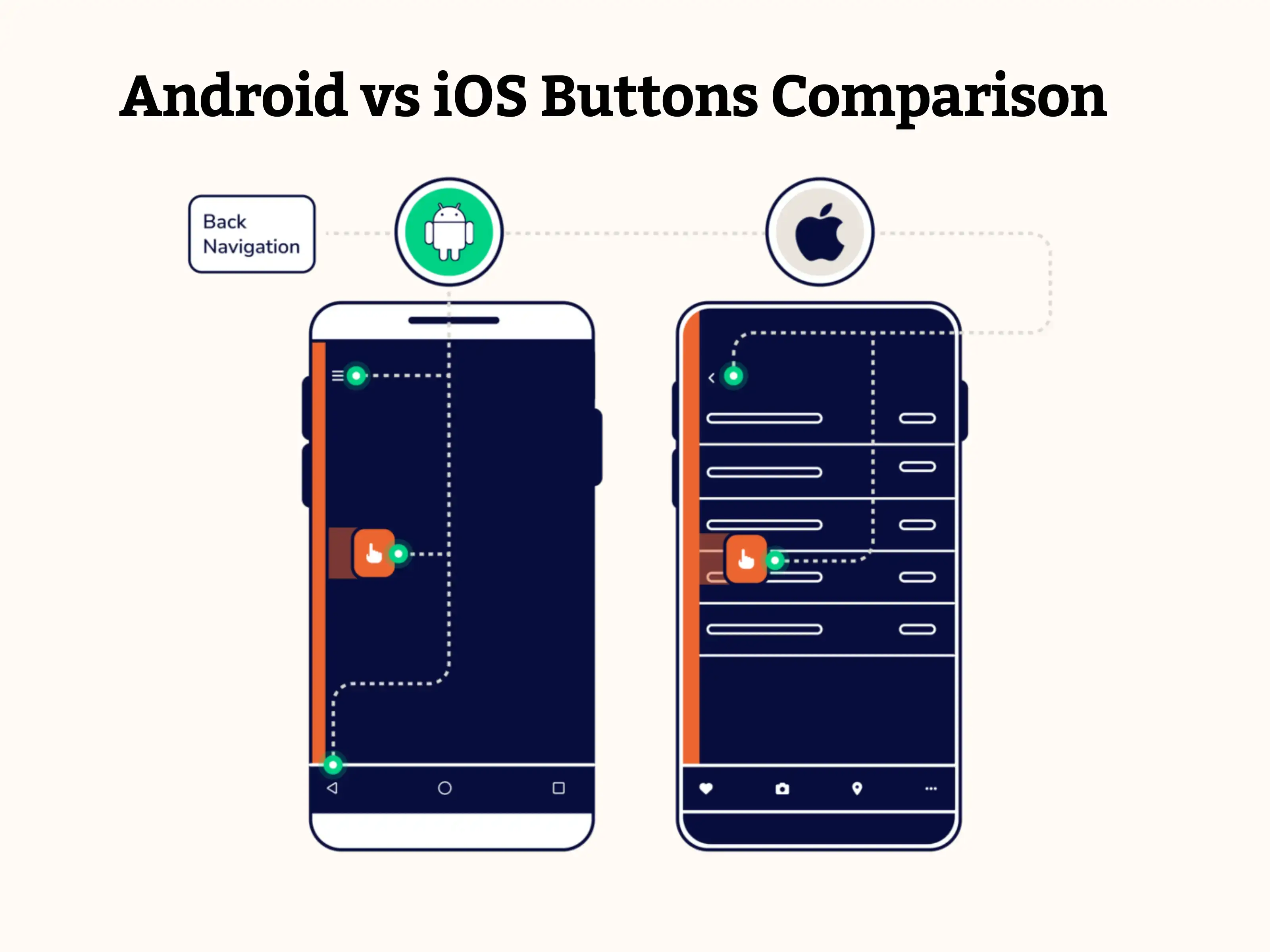
Android vs iOS Buttons Comparison
The primary difference in button designs between Android and iOS apps UI is that iOS buttons stick to the flat design pattern and support the title case. Nonetheless, the greatest Android app designs are inspired by Material Design. Thus, they include shadow-styled buttons and uppercase text by default.
The Floating Action button, which both Android and iOS utilize, is another fashionable button that functions as a call to action button.
Android vs. iOS Typography
Helvetica Neue was Apple's preferred typeface for many years, but 2015 the company made a bold move to San Francisco. San Francisco is more room-efficient and ideal for desktops, mobile devices, and the iOS Watch.
Roboto has long been the default system font on Android devices. Furthermore, Google has no immediate intentions of modifying this cherished feature.
While the texts' overall sizes are comparable, there are major variations in the font sizes and layouts between Android and iOS material designs. Android has more white space between words, whereas iOS mostly uses strong type to create the text hierarchy.
Android vs iOS Control Design Search
The recent addition of a "Search bar" to Apple iMessage highlights the importance of search capability for both systems.
Apple offers two different kinds of search options: hidden and conspicuous. The search bar is sometimes hidden by dragging the screen from top to bottom, but it is often visible on the top tab. Additionally, you may use "X" to clear the search query and "Cancel" to cancel it.
Search bars are always available on the top tab on Android devices; they are not buried. You may just click the "←" button to end the search, and you can clear the query like on iOS.
Android vs iOS: Action Menu
Any button on iOS that tries to act will cause an action menu to appear. Since the menu is reachable with the thumb, it moves up from the bottom. The most recent iOS trend features a context menu that displays associated activities when you press and hold an element or piece of content. The context menu appears with the backdrop blurred.
The menu opens when a three-dot icon for "more options" is touched on in Android. This icon is often seen on the right side of the content. A little pop-up box appears along with the selection.
Android vs iOS UI Comparison: Navigation
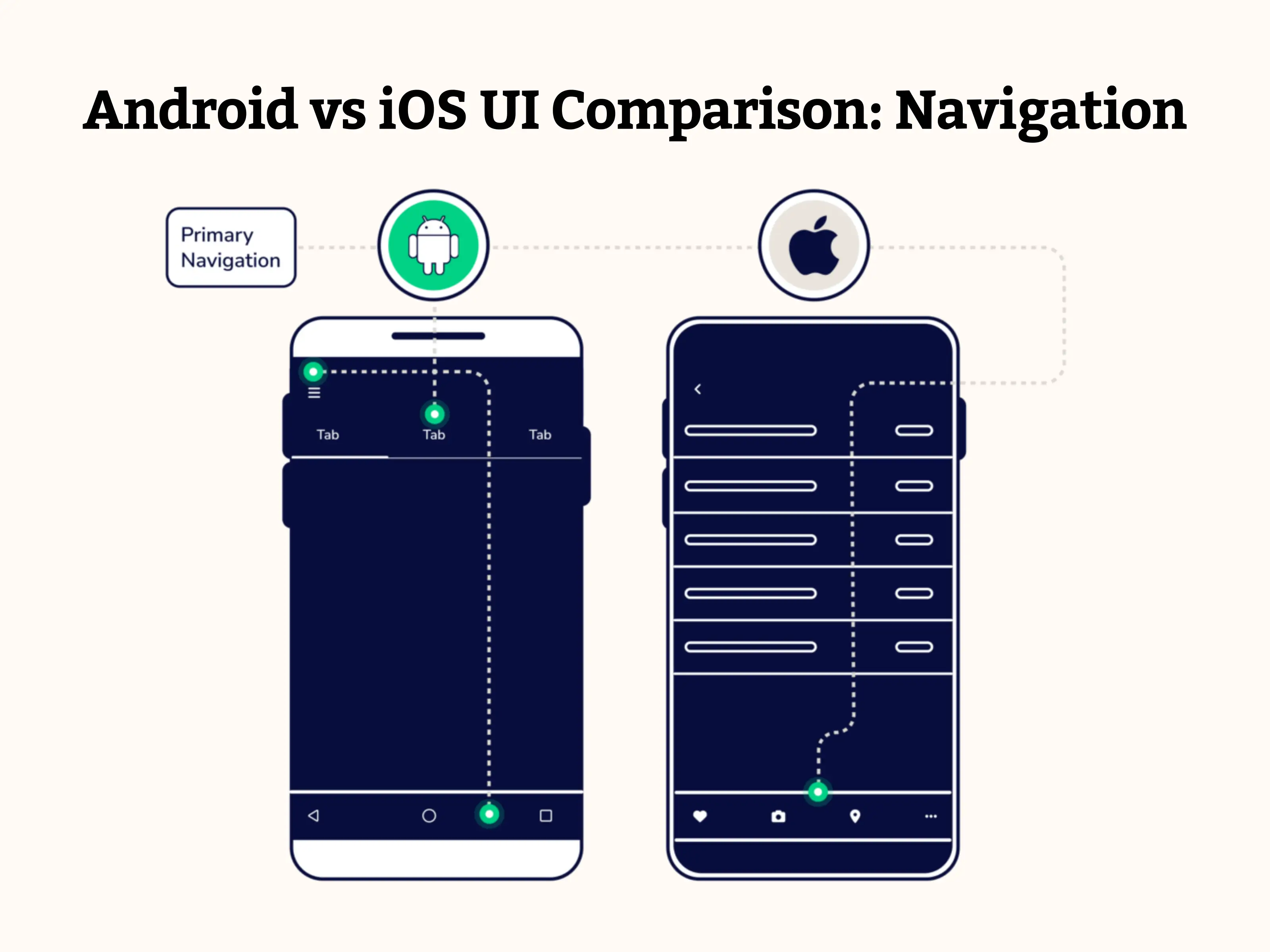
Primary navigation
The hamburger menu is intended to hold features that are sometimes used, and the foreground is the principal in-app navigation pattern in iOS applications. When comparing the user interface designs of Android and iOS, you will notice that the former has more prominent navigation options, such as a search bar and floating action buttons. At the same time, the latter places them all in the hamburger menu.
Secondary Navigation
A navigation drawer is a menu that slides open from left to right when the hamburger menu symbol is clicked. The user may navigate between views, data sets, and functional parts of an application by using the tabs positioned just beneath the screen title.
According to the Apple Human Interface Guidelines, no conventional navigation control resembles the drawer navigation menu. Rather, all iOS apps have a tab bar at the bottom of the screen serving global navigation. This allows users to navigate rapidly between the program's key areas. The secondary navigation is located under the "More" tab.
Navigation at the top of the screen
According to Android design guidelines, apps often show the title in the upper left corner after a drawer menu or an optional back button. Moving slightly to the top right, the overflow menu is always displayed after an action item, such as a search icon (which may be more than one, such as a favorites symbol).
Regarding iOS applications, the previous tab's name is consistently shown in the upper-left corner, adjacent to the back button. The name of the active tab appears in the center, and, depending on the situation, a control button labeled "Edit" or "Done" is located in the far right corner.
[ Also Read - What is Offshore Development Center (ODC)- A Complete Guide 2024 ]Android vs iOS: App icons and Screen resolution
In both systems, the screen structure is constructed using an 8dp grid, with 16dp margins being the most common.
Every app on iOS and Android has a unique graphic that serves as its icon. Typically, the user chooses whether or not to learn more about a program based on its icon. An attractive icon draws attention and is the main factor in an application's download or purchase.
Every iOS icon is shaped as a square and rounded off at the edges. Apple affirms that simple backgrounds and flat, nontransparent pictures are preferred over superfluous text, graphics, and UI elements.
On the flip side, Android icons can have any form that fits the icon region and can be translucent in the backdrop.
Android vs iOS: Comparison Table
| Feature | Android | iOS |
|---|---|---|
| Design Language | Material Design (Focuses on shadows, depth) | Flat Design (Simpler, cleaner aesthetics) |
| Navigation | Back button (top or bottom), app drawer | Back button (top left), gestures (swipe) |
| Button Placement | Top or bottom | Bottom |
| Customization | A more flexible, wider range of fonts | Standardized, limited font options |
| Icons & Visuals | More varied shapes and colors | Simpler, flat style icons |
| Typography | Bold fonts encouraged for readability | Emphasis on readability, consistent style |
| Screen Sizes | Wide range of screen sizes and resolutions | Fewer screen sizes due to device control |
| Unique UI Elements | Floating Action Button (FAB) | None |
| Date Pickers | More variations in style | Consistent style across apps |
| Dialogs & Alerts | More diverse styles | Consistent style across apps |
| Tabs | Can be placed at the top or bottom | Typically placed at the bottom |
Conclusion
This blog addresses all the essential distinctions between Android and iOS app design, which will help you get started with product creation services. The distinctions we found between the iOS UI design and Android apps will be useful when you build mobile applications for iOS or Android. It is important to stay up to speed with the latest standards revisions to enhance the likelihood of your app being accepted on these platforms.
The choice between iOS and Android depends on what we must provide our clients. Because each has a unique design language, designers of user interfaces for iOS and Android can create comparable features for users of the two platforms. Choosing one is challenging because each has advantages and will be the best option for a certain group of users.
Do you want help speeding up the development of your app? Get in touch with our team for iOS and Android app development services, and we will help you whenever you need the finest possible service.
Frequently Asked Questions

Read more blogs

Time and Cost of Developing an AI like ChatGPT: Key Factors Explored
Explore the factors influencing the time and cost of developing an AI model like ChatGPT. Understand key considerations for successful AI ap

Guide to Successful Real Estate App Development: Features, Technologies, and More
Explore the advantages of developing a real estate app, key features, technologies to employ, and the importance of collaborating with a Rea

Custom vs. Template-Based Website Development: A Comprehensive Cost Comparison Guide
Explore the costs, pros, and cons of custom website development vs. template-based solutions. Make an informed decision for your online pres